Canna and Society Garlic
Originally uploaded by gardenwiseguy
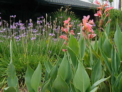
Here's something to chew on. I was just looking over a few of my pictures and spotted this one that I use when I teach my garden design classes. It's an image from the project I designed for the Goleta Water District a few years back. I think it exemplifies a "Santa Barbara-style" composition, if there is such a thing. Perhaps it can be a starting point for a conversation about designing not only in our Mediterranean climate, but has implications anywhere. In this example, so fairly common plants are combined to create a killer combo.
One of the simplest concepts for bringing interest to a garden is the impact that can be created by working with contrast and harmony. Here's a crash course...
Starting with the pinkish canna lily (Canna eribus) in this photo, we see that its visual character is comprised of its architecture (the overall form of the plant) which in this case is as follows: a vertical "posture" and broad, upright, spearhead-shaped leaves. The stems will easily reach 5 to 6 feet high. The flowers are large and in proportion to the rest of the plant.
The colors are a greyish-green leaf and coral flowers. Coral is the "tint" of a slightly orangy red. If you were mixing paint you'd take a good amount of red, add barely a dot of yellow (moving it toward orange) then dilute the whole thing with a heapin' helpin' of white. White makes a basic "hue" become a "tint." O.K., let's keep it simple - pink is the tint of red.
Now for the Society Garlic (Tulbaghia violacea) in the back. Its architecture is fine textured and grassy, but is similar to the canna due to the predominantly vertical direction of the leaves and flower stems. The plant is small, growing only to about 12" (18" when flowering). The flowers are small and, again, in scale with the plant.
The flower color is also a tint, in this case, its as if we took a big dollop of purple and mixed in some white. The foliage is a medium green, with a little yellow.
Time to wrap up.
Contrast: The contrast is created by three features: fine texture (Tulbaghia) against coarse texture (Canna); contrasting flower color; and small plant / large plant.
Harmony: Both plants are vertical in their stance; both are within a range of green foliage (as opposed to pairing silver and purple foliage); both have flowers that are the tint of their base hue.
So what does all this mean to you?
Grab a visual concept before you begin putting a plant palette together. Look at not just the flowers, but the totality of the grouping. Better yet, when you look at a planting design you like, see if you can "reverse engineer" what's going on. It might give you a clue to what excites you and you'll have a better chance of creating something great for your own garden.
One last observation - the plants were used in distinct groups, not intermixed. That makes for a much stronger overall statement.
Later, skater...
~~~~~~~~~~
A thought after posting this article: I've been reading some early reactions to this post and readers seem to appreciate these design tips. I'd be glad to continue this as a series - just let me know some design topics you'd be interested in. GWG
11 comments:
It is often hard for beginners to see the big picture so many thanks for the great tips.
Some great principles. I often notice these techniques in gardens that jump out at you. Your tips are fantastic.
thanks for these tips! I honestly never thought of having any sort of design regarding my plotting of plants and flowers in our garden until I read this.
Even those of us who have been around the garden a while appreciate your explanations of the concepts that we may intuitively know but can't verbalize!
To all who've left words of appreciation about this post, thank you. I'm considering making these design tips a regular thing. Let me know other topics you would find helpful.
BG (aka GWG)
Yes please!
Here's a challenge: Since so many folks in our area have dogs, any suggestions on creating a yard that is beautiful, sustainable, dog proof, AND dog friendly?
Great idea...what is the watering and feeding care for these plants you used in your design?
Thank you, thank you, thank you!!! I've read many gardening books that treat design like almost a mystical thing, you either have an eye for it or you don't. Your descriptions were clear and east to understand. I like how you took a picture and dissected it, explaining how each element worked with the others. The designs themselves are dramatic and contemporary. I’m loving the tradescantia and silver agave, even though I don’t know what tradescantia is. I’m looking forward to more posts!
Oh! Tradscantia is Purple Heart! A plant I could not be MORE familiar with. Helps when I read the post instead of just looking at the pretty pictures.
Being about as colour savy as a labrador, I alway enjoy when others write up garden design stuff
I adore Garlic Society!!!
Post a Comment