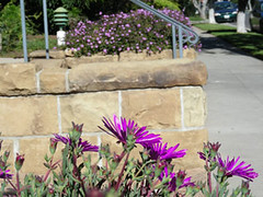

Well, not quite purple, but who would pay $8.00 to sit in a dark theater and watch "The Color Mauve"? I'm feeling downright professorial tonight, so I'll expound for a few paragraphs. I reshot this series today in front of my house. I actually have a better slide of it somewhere, using a lens that brought the background lantana a bit closer, but this will do.
As I gain a bit more knowledge about color and how we perceive it, I try to pass the info on to my adult education students so they have a broader knowledge of how to use color in their gardens. This is little series is a perfect example of how the same color can play completely different roles in a garden composition.
The iceplant in the foreground (Lampranthus spectabilis) has an eye-popping intensity, but the same color of lantana (Lantana montedvidensis) pales in comparison. As we look closer, we see that the surface of the iceplant is extremely glossy and reflects a lot of light.

 Zooming in, we see that the texture of the flowers is soft, like well-worn fabric, preventing the sun's rays from bouncing off as vigorously.
If all the plants you use are of a similar value (regardless of the color), the scheme will be more harmonious. On the other hand, if you intentionally combine a flower of high value with others of lower value, you can achieve a very dramatic impact. There's no right or wrong way to combine colors. Just be aware of how all the variables come into play and use them as you will.


11 comments:
Yummy colors here. I love chartreuse and purple together.
I'm always interested in the theory of color but for me I think it will always remain a theory for me as I've never had enough plants live long enough in one spot to form a composition. Change is the byword in my garden and I've given up on perennials finally because I find annuals more adaptable to these ever-changing conditions.
I agree with Kylee--chartreuse and purple go well together, as does orange and yellow. However, I don't think any of our yellows or oranges would go well with the ice plant's intensity. I have this plant, but it surround the trunk of a palo brea tree, which is pale chartreuse. It is striking!
Happy GTS,
Aiyana
Great tutorial! I'm very sensitive to color, but I hadn't given much thought to plant texture's effect on color.
It sounds like your class is in for a treat! I'm sure you provide examples of the combinations you mention here. Do the students also visit sites for examples?
Interesting post.
I really like you blog
Hello Billie, I just have given you award for excellence :) please come by to pick it up.
Greetings,
Ewa
Great photos and information. Happy belated GTS,
Aiyana
This is the kind of post I love coming upon. I've learned something valuable - mostly I just go on instinct and sometimes things work or some bomb. It's better when I have some understanding of why. You've explained and demonstrated it well ...
I hope you are still posting. Please say that's so!
me again - kate from Regina, Canada
I figured it out .... you're busy drumming.
Nikkipolani: Yes, my students get a 1/2 day tour for our last day of class. The class consists of 6 Monday nights, 3 hours each. We cover all the steps a landscape architect follows (or should!) to get to a planting design - site analysis, needs analysis, concept development, bubble diagrams, schematic planting based on function, then all the aesthetics. We also do a few exercises and looks at a few hundred slides.
We wrap up with a Saturday morning tour of gardens I've designed and see how it all the theory fits together.
Let me know when you move to Santa Barbara and you can join the gang.
Post a Comment